CONTEXT
A UI/UX study done as a passion project.
TEAM
Sanya Rupani (Solo)
TIMELINE
September 2024
3 Weeks
🎯 Reorganize and modernize Goodreads.
OVERVIEW
The primary objective of this case study is to enhance the user experience of Goodreads by improving its usability and visual appeal. For this case study, I used only my own experience with the app since I was going to be focusing more on the UI end.
There are a lot of complications within the user journey, making it challenging to add books to a library and view/interact with your friends and groups.
DESIGN PROCESS
I started by doing a competitor analysis in comparison to the analysis of the original app. While StoryGraph was a little more straightforward with navigation, it still had tons of features that went without explanation. I would have had to do extensive research elsewhere before clicking some of the buttons. This isn't a cue to take from the competitor, since an application should ideally be self explanatory.
I then organized the information architecture of the Goodreads to simplify navigation according to what would make sense as a user and created low fidelity mockups accordingly. I created an updated style guide for the application as well, based on the current style but modernized and simplified. I also created custom components for new features.
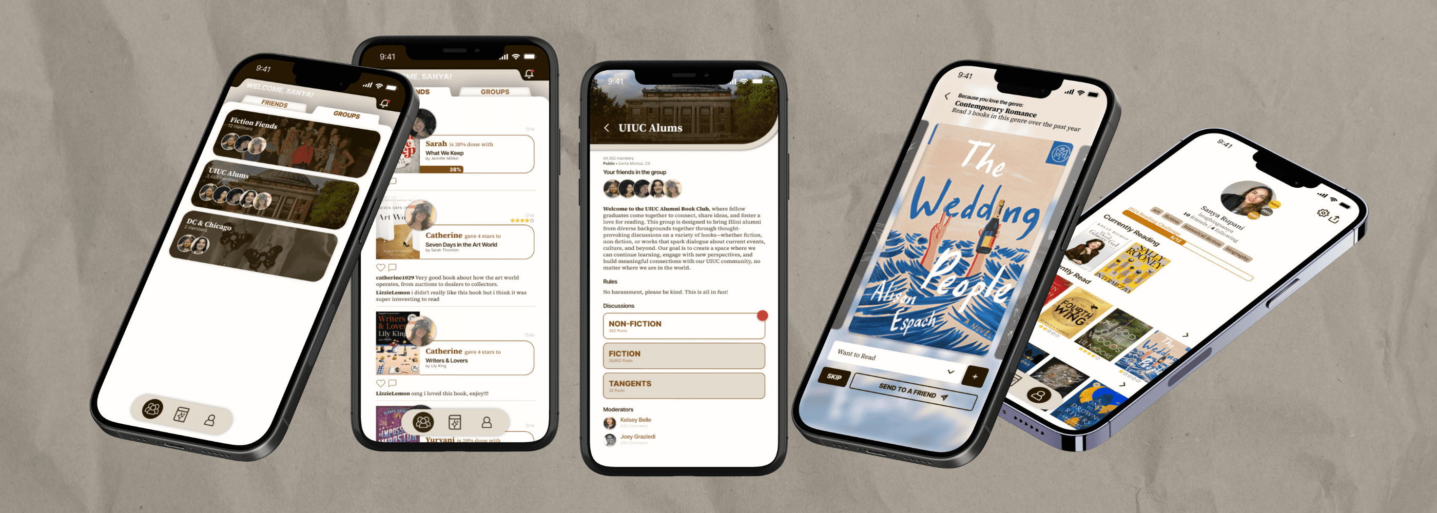
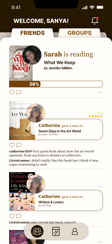
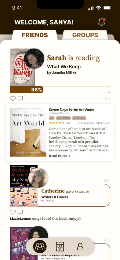
FRIENDS FEED (LANDING PAGE)
Separating the landing page into two sections (friends and groups) helps differentiate the social features of the application. This makes it easier to find your groups, instead of having to navigate to various group pages via your own profile.
Friends feed has the same updates as the app currently features (book progress, adding book to shelf, finishing book, etc.) but displays the information in a more cohesive and interesting way (ex. visualization of the progress bar).
Added option to click on a friend's update to view more details about the book that they're reading. This is a simple way to explore the books that your friends are reading or recommending without leaving the feed.
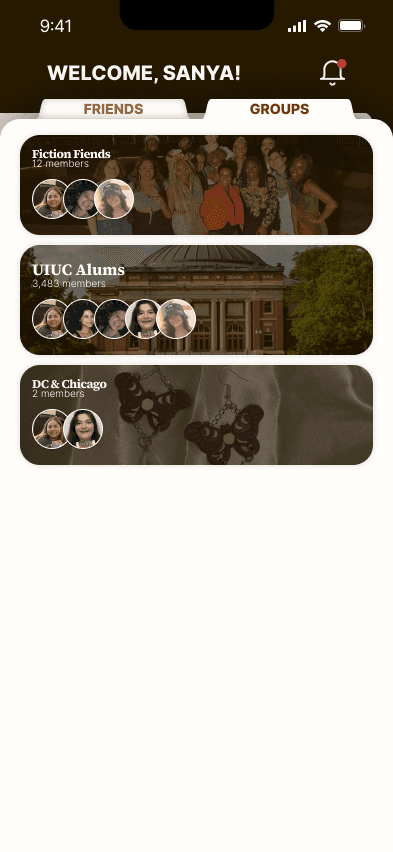
GROUP FEED (LANDING PAGE)
This updated view for groups makes it easy to view all your groups & group updates at once in a centralized area. The initial page shows avatars of your established in-app friends that are also in the group, just for a quick peek inside.
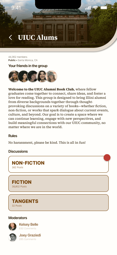
The group details page includes more information, as well as discussion boards. These discussion boards exist currently on the Goodreads app, but they're difficult to navigate to and fully read. I differentiated the read and unread discussion boards using background color and a red notification dot, so the user can very clearly see how much they need to catch up with.
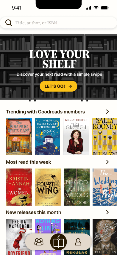
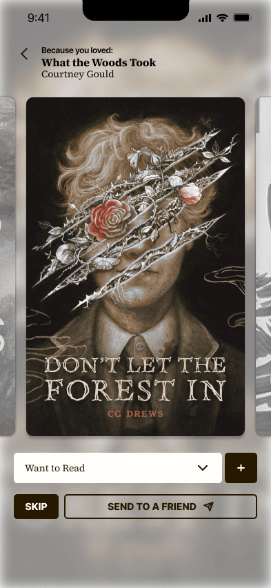
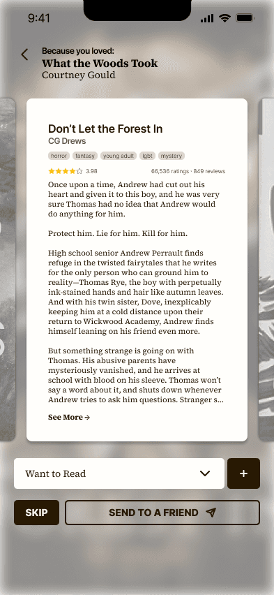
DISCOVER PAGE
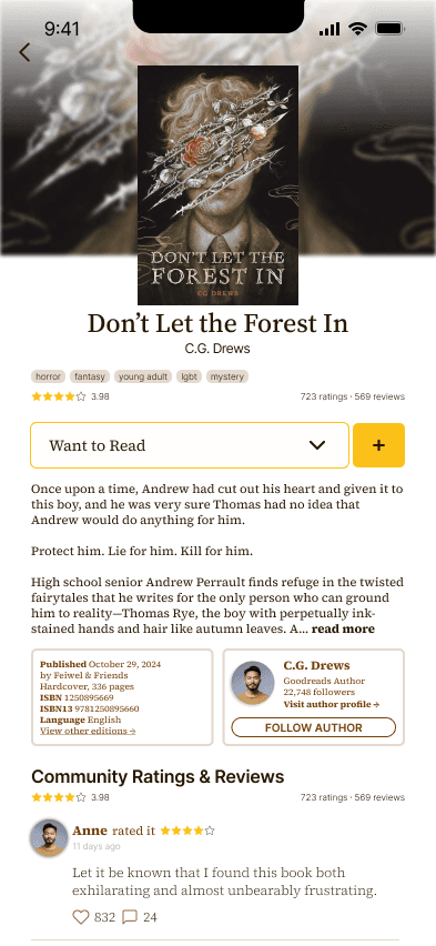
This is not a huge change from the current page in terms of lists at the bottom. The main feature update is the addition of the "Love Your Shelf" book discovery, which leads to book suggestions based on your previous reads or your friends' recommendations. It displays the book and you can click the cover to view a synopsis before adding it to a shelf. The synopsis page allows you to dive deeper into the book, in case you want to view public reviews or the author's profile before committing it to a shelf.
The feed will automatically go to the next book once you take an action (add to shelf or skip)
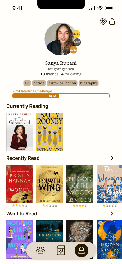
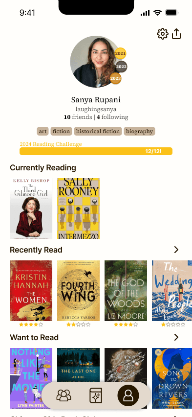
PROFILE PAGE
This new and improved profile page still includes all the information that Goodreads previously included, but simplified and more interactive.
The badges on the profile picture signify your medals for previous years, as Goodreads currently has no way to show off reading accomplishments for years past. This will incentivise users to continue logging their reading and hopefully even read more.
The progress bar updates color as you get closer to your yearly goal, from bronze to silver to gold
Your favorite genres are highlighted in the same pill format as in book profile pages for continuity
All your shelves are visible and clearly separated (currently, Goodreads organizes this in the most confusing way possible)